Creado - TemplateMonster Releases the First Template Built On the Revolutionary Grid CSS Technology
June 16, 2017 (PRLEAP.COM) Technology News
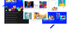
June, 16, 2017 - Ft. Lauderdale, FL. TemplateMonster launched a Grid CSS Theme Creado.Grid CSS is the technology allowing to build any kind of website grid, be it a layout or structure. We believe that the technology will become a standard in websites creation in the nearest future, but the fact that namely TemplateMonster's professionals were the first (or one of the first developers) who released the template based on Grid CSS will stay immutable. Please meet Creado!
Creado is a bright and irresistibly appealing responsive WordPress theme built for art galleries and any other websites related to culture and aesthetics.
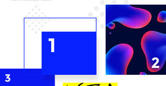
It lets you display your visual content like never before. Powered by the Grid CSS technology, Creado allows you arrange your content in more freeway.
Layouts that adapted to the available space were often brittle and resulted in counter-intuitive behavior as space became constrained. As an alternative, authors of many web applications opted for a fixed layout that could not take advantage of changes in the available rendering space on a screen.
The capabilities of grid layout address these problems. It provides a mechanism for authors to divide available space for layout into columns and rows using a set of predictable sizing behaviors. Authors can then precisely position and size the building block elements of their application into the grid areas defined by the intersections of these columns and rows.
Grid layout can be used to intelligently resize elements within a web page.
Grid Layout controls the layout content by means of a grid an intersecting set of horizontal and vertical lines that create a sizing and positioning coordinate system for the grid container's contents.
Here are some of its features:
The tracks (rows and columns) of the grid are declared and sized either explicitly through the explicit grid properties or are implicitly created when items are placed outside the explicit grid. The grid shorthand and its sub-properties define the parameters of the grid.
The contents of the grid container are organized into individual grid items (analogous to flex items), which are then assigned to slots (grid areas) in the grid. They can be explicitly placed using coordinates through the grid-placement properties or implicitly placed into empty slots using auto-placement.
Once the grid items have been placed, the sizes of the grid tracks (rows and columns) are calculated, accounting for the sizes of their contents and/or available space as specified in the grid definition.
The resulting sized grid is aligned within the grid container according to the grid container's align-content and justify-content properties.
In grid layout, the content of a grid container is laid out by positioning and aligning it into a grid. The grid is an intersecting set of horizontal and vertical grid lines that divides the grid container's space into grid areas, into which grid items (representing the grid container's content) can be placed. There are two sets of grid lines: one set defining columns that run along the block axis (the column axis), and an orthogonal set defining rows along the inline axis (the row axis).
This is a really innovative feature that frees you from old layout restrictions. Express your extraordinary character in a new way. Don't afraid to add a bit of creative mess to your website.
The theme has a sleek, modern design. Each design element is carefully crafted and corresponds with the latest web design trends.
Creado includes 7 header layouts. It is equipped with Live Customizer, which allows to customize your site with multiple theme options and view all the changes you make to your design live, without the need to reload the page.
Custom Widgets
The theme gives you the possibility to take full advantage of custom widgets that enrich your theme with advanced functionality. Simple Slider, post carousel, and social media widgets help you build a strong online presentation and offer you additional ways for displaying your content.
Fully Responsive
Creado is the mobile-friendly theme that looks great on any device and screen resolution.
SEO Friendly
Theme's code and structure are additionally optimized to fit the Google guidelines for websites. Creado will help you reach the top of search results.
Google Fonts Integration
Feel free to choose from over 500+ Google web fonts to customize and adjust the design of your website according to your needs.
Creado offers 24/7 effective and friendly support. It's free for a lifetime.
Documentation
The theme comes with easy-to-follow documentation that guides you through each step of setting up the theme and using it for your project.
"As websites evolved from simple documents into complex, interactive applications, techniques for document layout, e.g. floats, were not necessarily appropriate for application layout. By using a combination of tables, JavaScript, or careful measurements on floated elements, authors discovered workarounds to achieve the desired layouts. "- David Braun, CEO at TemplateMonster.
About TemplateMonster.com
TemplateMonster is one of the world's leading manufacturers of ready-made websites templates of any complexity. As of today, the number of products in the company's catalog of templates, and ready-made web sites has exceeded 26,000 units. The company's templates work with all popular engines including WordPress, Joomla, Drupal and many others. Their customers receive ongoing 24/7 support and maintenance from personal managers. For more information, please visit our website.
Source: https://www.templatemonster.com/press/creado-templatemonster-releases-the-first-template-built-on-the-revolutionary-grid-css-technology/


