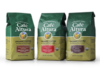
Pioneer Organic Coffee Company Re-Brands for Growth
July 24, 2019 (PRLEAP.COM) Business News
Solvang, CA United States - Cafe Altura, the first organic coffee producer in the U.S., rolls-out updated branding and packaging as market changes dictate new look to entice coffee consumers.Cafe Altura began in the late 1970's when a group of organic enthusiasts gathered in Ojai, California, to live and work on a 75-acre farm. Their idea was to farm the ranch organically and develop related businesses. By happenstance, a group of visitors told them a story of a farm in Mexico that had been growing coffee using organic and biodynamic techniques for 20 years. Intrigued, they traveled to Chiapas, Mexico, and begin importing the beans, becoming the first company in the U.S. to ever sell organically grown coffee.
Thirty-plus years later, Café Altura's quality has never been better but intense new competition was challenging their sales. Dozens of startups were entering the exploding market with new flavors and roasting styles, stealing valuable shelf real estate.
The branding had not been updated since the 1980's and consumers were noticing; it was time for a change. The design firm Mark Oliver, Inc. was hired to create new branding and packaging designs that would showcase the organic origins of the coffee, improve quality and value perceptions and increase the line's visibility in the store. The design had to work with whole bean, ground and instant products for more than 80 SKUs.
Chris Shepherd, CEO and co-founder, told the design team to "focus on the firm's authenticity, the real "story" behind the product; on organic or "natural", pure, simple and "clean" ingredients; on the quality of the beans sourced from family farms; and on a great taste experience."
However, many competitors today share some of these same attributes. What was needed was something to set Cafe Altura further apart. The design team created a position statement and tagline: "Rain Washed, Sun Dried, Air Roasted." This was an essential selling point that no one else was using, even if other firms used the same process. The tagline helped to build a richer, more vivid picture of the product in the mind of the consumer.
The new labels create a narrative of the company history with text and specific visual cues. An illustration of a farmer tending his coffee trees anchors the concept visually, focusing attention on the organically grown family-farm product link. An "Aztec-style" pattern background is used in the panels and a badge announces the type of coffee and its condition (ground, whole, etc.).
The new look has been well received by customers, brokers, distributors and store buyers as the updated packaging continues to rollout nationally. Shepherd notes, "The packaging is beginning to have the desired effect. It is a tough market environment, but, all things considered, we're now well-prepared for the challenge."
Mark Oliver, Inc. is a California award-winning branding and packaging design agency specializing in food and beverage consumer packaged goods for clients nationally. To learn more about this project and others contact Mark Oliver at 805-686-5166.
To learn about this project and others, visit www.markoliverinc.com
